Author: Matt Sowden

  • Aegis Analytics v5.3 – Release Notes

    Aegis Analytics v5.3 – Release Notes

    With the changes to Activity Completion, Improved Quality Settings, and introducing the new Focus Tab, this release is packed with exciting updates. So, grab your gear and get ready to hit the slopes as we tell you about the mountain of changes in Aegis Analytics v5.3.

    What’s new?

    • Added the Focus Tab, which allows you to drill down on specific areas of your schedule and generate reports for specific sections.
    • Quality control settings, including activity code exclusion and custom DCMA tests
    • Tab layout in the Project View is now fully customizable
    • New “All” view added to the Activity Completion component
    • Driving Path now shows the top three paths, expanding from previously showing only the first driving path.

    Let’s prepare by showing off some of the highlights. Or you can grab your board, hit the chair lift and get started today by visiting https://dashboards.consultaegis.com/

    Focus on unique parts of your schedule so you can hit the perfect run. Every time.

    At Aegis, we’re about the details. With the Focus Tab, you can now drill down and generate reports containing Activity Completion (Critical activities are categorized as those on the first driving path), Float Consumption, Driving Path Analysis, QC Review or DCMA (based on quality settings), Index Trending (CPLI/BEI), Critical Path Risk (uses first driving path), and Critical Path Reliability (uses first driving path).

    These focus areas can be modified at any time, allowing you to focus on how each part of your project is going to tackle those often-overlooked areas for improvement, and highlight overachieving areas. Easy to understand at a glance, yet comprehensive enough for analysis and optimization.

    Determine the quality of your schedule on your terms. We’ll adapt to you.

    Quality Settings can now be modified to exclude specific activity codes that may not need QC consideration. This puts the power back in your hands by allowing you to use custom codes for areas like Procurement without worrying how they will impact your overall score.

    In addition, you can now issue custom DCMA-based tests with adjustable thresholds to meet individual targets that may have different calculations for Quality than the industry standards or our Aegis-standard tolerances.

    Layout control – so simple you’ll think it’s the bunny slope.

    Component and Tab visibility can now be managed in each project with the new “Layout” section of the Project Page. From this section, you can change layouts, manage tab visibility, and set up your project the way you want it to look and feel for the perfect presentation.

    See everything from the top of the mountain with Activity Completion.

    Activity Completion now has a new “All” view in addition to the Start/Finish views for our Activity Completion component. This allows you to show an aggregate of both the start and finish views for the last period graph, planned task percentages, and their corresponding grids.

    In addition, the Activity Completion Trending chart plots the total lines from each of the start and finish views so you can see everything that lies ahead of you before plunging down the slope.

    So much more to come.

    Aegis Analytics is built by professionals that are deeply committed to the small details. We want our platform to be the multi-tool the industry needs, and with these new additions we think it will not only improve your output, but also help you dig deep into the details to unearth actionable insights.

    To get started today, pull up a chair by the fire in the ski lodge, grab your warm drink of choice, and visit https://dashboards.consultaegis.com ⛷️


  • Aegis Analytics v5.2 – Release Notes

    A minor release with some major upgrades, we’re punching well above our weight with our newest edition of Aegis Analytics.

    v5.2 release summary:

    • P6 database connection – import and sync schedules
    • New risk type – core risk
    • Compare tab – schedule comparisons
    • New performance trending component
    • New driving path analysis component
    • Activity start tracking
    • Customizable overview tab
    • Report center and batch exports
    • Component-specific notes
    • Data fetch and loading speed improvements

    Connect to P6 directly

    You can now sync your Analytics projects directly to your P6 database through a one-time import or scheduled sync. XER uploads are no longer required! And that’s not all. We also support connecting to Microsoft SQL Server instances Aegis does not host, so we are officially BYOD! (Bring your own database!)

    Note: Connecting to databases not directly accessible to the internet is a feature in active development and will be released in the next update. Oracle SQL Databases will be supported in future updates.

    Automate your schedule imports

    With the addition of database connections, you may now also automate schedule imports by setting up a sync schedule in project settings. This allows your projects to remain up to date without manual intervention and recent changes to be brought in automatically.

    New risk type – Core risk

    We’ve simplified our Risk Register to allow you to identify and assign activities to your risks quickly. For projects using Core Risk, adding a new risk is as simple as giving it a name. To analyze your saved risks using the Monte Carlo Simulation component, simply add the activity impact %, and assign the relevant activities to the risk

    You can switch from Core Risk to our full-featured Risk Register anytime to expand on the details of your project’s risks.

    Spot the difference

    In this release, we focused intensely on schedule analysis. To that end, we have created the Comparison tab, which allows you to see a summary of differences between updates – condensed into an east-to-understand report format.

    Let’s talk performance

    The new Performance Trending component allows you to select any Activity Code type and chart its performance through each schedule update. Save your selections for easy reference the next time you visit the project.

    New driving path component

    We’ve added the Driving Path Analysis component to the Schedules—Analysis tab. With this component, you can view the driving path to any interim milestone or activity. Just make your selection, and the path will be calculated in real-time. This data can also be exported to Excel.

    Activity start tracking

    We’ve added a start/finish toggle to the Activity Completion component to allow users to swap between start and finish date tracking. This selection also updates the trending chart below, to show historical activity start percentages for each update.

    Customizable overview tab

    You can now edit the Overview tab to include only the components relevant to your project/team. Manage the overview components in Overview tab in the Project Settings window.

    All components now have individual note sections. Click the notes button to add new notes or view notes from previous updates. All components will also display their current notes in the Overview tab PDF export.

    A place for all your reports – Reports center

    We have created a new report center that allows you to manage your report templates, batch-export entire reports folders, and receive PDF report packages via email.

    Continued optimization

    We’ve improved how data is fetched and moved certain computations to the front end. This increases the number of devices we can support and enhances the application’s general performance.

    We are excited for you to try the new features – current users can get started today at https://dashboards.consultaegis.com. If you think Aegis Analytics can boost your team’s performance, contact us for a demo at newopps@consultaegis.com

  • Aegis Analytics v5.1 – Release Notes

    At Aegis, we care about the quality of everything we do, and that extends to quality of life improvements in our Software. With Analytics 5.1, we introduce a variety of small changes that when added up deliver a huge quality of life improvement of our service that we think you will love. From score improvements to new customizability to even more ways to view your data, Aegis Analytics continues to evolve and provide you with unparalleled insight into even the most complex of schedules. Welcome to 5.1!

    What’s New?

    • We’ve tweaked our QC score metrics to drill down to give you a more dynamic view of your project’s health.
    • We’ve improved the Schedules Tab to give you better access to important schedule data, and the ability to modify the selected cost baseline.
    • Our gantt chart has been modified to show Data Date indicators, letting you see due dates at a glance.
    • Schedule Reports can now be grouped by activity or WBS codes, and even saved for later or iterative review.
    • Data load times across the board have been improved by an average of 80%

    Introducing Higher Quality in your Quality Control Scores.

    We’ve introduced new metrics and updated some old metrics that will impact your project’s Quality Score to give you a more accurate view of your project’s health. Many of these new metrics can also be viewed on the Schedule Analysis Component.

    • Out of Sequence activities now have variable impacts based on criticality
    • Hard Constraints now include “Start On”, “Finish On”, and “As Late as Possible” constraints
    • We’ve added “Open Start” – an activity’s only predecessors are FF relationships – and “Open Finish” – an activity’s only successors are SS relationships – to the QC Metrics
    • High Duration updated to use Remaining Duration instead of Original Duration
    • High Float threshold has been updated to 80 days + Critical float

    Gantt Charts that give you the outlooks you need.

    Gantt Charts now have the ability to show Data Date indicators right in the chart so you can see at a glance your project’s most important deadlines compared to other projects in your Gantt.

    Like that Schedule Report? Save it.

    Schedule Reports can now be grouped by WBS or Activity Code and even saved for future or iterative review over updates. You can also continue to customize your Schedule Reports using the previously introduced metrics to create reports that outline the data you need most, every time.

    New Components for your Consideration.

    We’ve updated some old components and added new components that we think will give you yet more unique looks into your schedule’s composition and overview.

    • Schedule Updates has been Updated to allow for a schedule to be selected as the Cost Baseline separate from the general Baseline.
    • We’ve introduced a Schedule Compression Component in the Schedule Analysis Tab to review the compression index and activities per day metrics over various updates.
    • The Schedules – Manage tab has been updated to provide more data fields, allowing for a complete and easy schedule matrix export.

    Quality we care about.

    At Aegis, we’re constantly improving our products based on feedback from Customers and Users of our software. If you have a feature you’d like to see added, or find a bug you think we should know about, our “Report Feedback” has moved to the Help Menu in the top right under “Contact Us”. We value every piece of feedback we get, and hope you enjoy Analytics 5.1 to the fullest! We have some very exciting new features in the pipeline, so stay tuned!

    To Get Started with 5.1, visit https://dashboards.consultaegis.com/

    New Customer? Sign up today at: https://www.consultaegis.com/technology/aegis-analytics/

  • Aegis Analytics v5.0

    What’s new?

    • Cost tracking is finally integrated into Analytics, with budgets, completion costs, and historic performances all ready to view!
    • New tabs for tracking cost, schedule analysis metrics, reporting, and an overhauled overview tab allow for easy access to the most important data
    • Unlimited milestone tracking! The milestone component is no longer restricted to five milestones
    • All pages in the project view can now be exported to PDF from the project menu, replacing the executive report
    • The portfolio page layout can be modified, saved, and swapped to your heart’s content. We also included a new Gantt view for visual feedback on your portfolio’s health and status!

    Bust out the party hats and get ready for the bash; let’s open up the presents and see what we have to celebrate with!

    Cost tracking, welcome to the party!

    We are introducing our newest feature: cost tracking! Using our innovative new tab and components (beta), you can take costs from your schedule and plot and track your project’s planned, current, and at-completion costs. They certainly know how to make an entrance!

    We’ve also added a new banner on the portfolio page, allowing you to filter for all cost loaded projects, and review past performance, as well as your portfolio’s upcoming costs.

    Put it on our tabs.

    We are introducing not one but three new tabs! Not only are we introducing our new cost tab (beta), but our new analysis tab contains your schedule comparison tools and a new schedule impact analysis component that identifies progress and logic change impacts in your schedules!

    Finally, the reports tab provides access to your entire schedule in a Gantt chart, allowing you to filter, group, and export your reports, all without having to open P6! Our analysis and reporting components will be expanded on in a future release.

    Take milestone tracking to the next level.

    Due to processing constraints, Aegis Analytics has had a 5-milestone limit for through-tracking during a project’s lifecycle until now. Our crack team of engineers has broken through this limitation and given us the green light to announce that you can now track to your heart’s content! Do you have a milestone that you want to add, remove, or change? No problem. We now have a tab for editing tracked milestones at any time in the project admin window.

    Like what you see? Export it.

    Instead of the old executive summary, all pages can now be exported directly into PDFs. Downloading and sharing tabs in your project has never been easier. We also overhauled our overview tab design to show you the most important high-level information.

    No party is complete without a bit of dress-up. Check out our portfolio view glow-up.

    We’ve massively overhauled our portfolio page, adding features that we hope will make using Analytics more engaging and useful.

    Portfolio page – project list gantt view

    We’ve added a Gantt view to our project listing view types so you can get visual feedback on project progress without doing the math yourself.

    Portfolio page – column selector

    We’ve added a column selector to the portfolio page project list, allowing you to focus on the data that is important to your projects!

    Portfolio page – layouts

    We’ve given you complete control over managing your layout in Analytics. You can save your preferred filters, banner, project list view, and data columns. Create several different layout options depending on what you want to see. This is all saved to your account so you can access your favorite views from wherever you are!

    Break out the party favors!

    We have so much we want to highlight, and no party would be complete without party favors:

    • Loading speed improvements—We’ve drastically changed how data is fetched from our backend, which has resulted in an overall increase in speed across the application.
    • Large project optimizations and performance improvements—We’ve examined how megaproject schedules are analyzed in our report generator and made some important tweaks and process improvements to speed up performance and reliability!
    • UI cleanup and clarity—In this release, we spent a lot of time reviewing our application and making the user experience more friendly and cohesive. This also included a complete upgrade of our front-end engine to make things snappier and more responsive.

    We think this party will be one to remember, and you’re invited! To get started using our v5.0 update, visit https://dashboards.consultaegis.com now!

  • Aegis Analytics v4.1

    We’re running down the checklist of industry-leading features with our latest release of Aegis Analytics, including more interoperability between companies, improvements to existing features, new components and ways to visualize your data, and some of our most often requested functionalities – finally available to everyone. Pack your bags for this release, because we will take you on a trip we call Aegis Analytics v4.1!

    What’s new?

    • We’ve added several new graphs and components and updated a few of our old ones to give you better graphical insight into your schedules using our state-of-the-art technology.
    • Improvements to our tight integrations between Risk Register entries and our Cloud Monte Carlo simulations allow increases in speed, performance, and accuracy.
    • Support has been added for schedules to be re-baselined inside Analytics so you can submit what you need to properly manage your projects.
    • We’ve improved our Risk Register import functionality and released a standalone Reactive Risk Register product for those who want a cloud-based risk register as a standalone package.
    • An improved and fully integrated Knowledgebase and Help System, giving users a step-by-step guide through our software.
    • We’ve improved the usability of our UI for features such as score settings and guest viewer access, allowing your project administrators to configure the software to their exclusive needs.

    Making waves with new displays.

    We’ve added new charts, graphs and exportable reports to make you the talk of the office. Our Progress Trending Chart and Schedule Comparison give users deep insights into the inner workings of project controls.

    • The new Progress Trending component allows you to review your project’s planned vs. actual progress based on the original and remaining durations.
    • The Activity Completion component can now be filtered by Activity Codes (if available in the XER)
    • We’ve also added a toggle to view activities planned for 30, 60, and 90 days from the date of your latest schedule
    • We’ve implemented a Schedule Comparison Gantt chart, which allows you to spot changes to your overall schedule quickly. Filter for critical activities and add one of our pre-set filters to view changes to your schedule’s activities, durations, progress, constraints, or logic.

    Integration at your fingertips, at a speed you can’t ignore.

    We’ve further integrated Monte Carlo and Risk Register into project controls standards, making the simulation an integral part to schedule monitoring and assessment. We have also continued to make our calculation process even faster to facilitate on-the-fly changes and timely decision-making.

    Baselines. Re-baselined.

    • We’ve added the ability to re-baseline projects, and adjust the Finish Milestone for existing/new schedules.
    • If the existing Finish Milestone no longer exists in the uploaded schedule, you’ll be required to select a new Finish Milestone before submitting.
    • You can review & adjust existing schedules’ milestones by clicking the “Edit” icon on the Schedules tab

    Import more risks, and export more insights.

    We’ve significantly improved our Risk Register Import, allowing you to import more of the data you already have to reduce human error and increase the accuracy and insight you can get from your integrated Risk Register.

    Risk register as a Service. Reactive Risk 1.0 releases today.

    We received so much interest and feedback in the cloud risk register that we’ve made it an additional standalone product that we are releasing along with our lineup of other products. For the technical-minded, features such as API access are coming very soon.

    Access to the Rhinoworks Shop Manual. Take command of your roadster schedules.

    We’ve built an incredible racing machine of an Analytical platform, and now we’re giving you access to our Shop Manual at https://docs.rhino.works/ so you can become the product expert in your office using the instructions and guidelines from the developers who built the roadster themselves.

    Give your clients a portfolio view to rival any Excel sheet.

    Individual client companies can now be added to your Analytics Account and be given read access to their portfolio of projects without impacting your license count. Clients can sign in with their e-mails and view their project portfolio, and even keep their own project data seperate from yours, giving them a portfolio view to rival any Excel sheet, included with your Aegis Analytics professional license, free of charge.

    We’re always making more.

    Analytics is continually growing and encompassing more of the project controls workflow. If you have a feature you’re excited about and want us to implement, let us know at apps@consultaegis.com

    Available today

    You can get started using 4.1 today by visiting https://dashboards.consultaegis.com/

    We hope you enjoy this update, and are as excited as we are to see what’s coming next for Aegis Analytics.

  • Aegis Analytics v4.0 – Release Notes

    Aegis Analytics v4.0 – Release Notes

    What’s New?

    • You can now model your organization’s offices, divisions or departments so employees and projects can be assigned to these organizational units.
    • We’ve improved our speed and accuracy in our calculation process even further, allowing for almost instantaneous data calculations for even the most demanding projects.
    • We’ve improved the look and feel of our software suite across the board
    • A new and improved project settings allow you to better control your projects data.
    • We’ve implemented a new account management system that allows 2FA and Passwordless login
    • Account Login has been overhauled and now allows for Corporate SSO.
    • We’ve added new reports and PDF exports across the board.
    • Multi project XER’s are now supported.
    • Improved Monte Carlo simulations for a higher degree of accuracy.

    We’ve got a lot to share with you, and we think you’ll be just as excited as we are once you see what’s in store.

    Whole-Team Management, from the lead roles to the supporting actors

    We’re thrilled to announce Corporate-Level, user-defined access control and permission management. Use our interface to manage your divisions, offices, teams, and sub companies all at the touch of a button in Account Settings (for administrators).

    Not just for Analytics, but in future releases of other Rhinoworks Software these divisions and corporate structure control tools will mirror in our other Applications as well, allowing you to configure once and deploy everywhere.

    Calculations so fast you’ll think we hired a wizard.

    While we can’t confirm or deny the employment of a wizard on our staff, it’s hard to argue with results. All calculations have a 5x improvement in speed and the accuracy has gotten even more precise. Not only will you see the improvements in our presentation, you’ll feel the speed in every calculation process.

    We’ve gone Open Concept. The Property Brothers would be Proud.

    We’ve continued our efforts to improve the use of screen real estate, Our graphs and layout have been reworked to show you more information on a single screen, and any of our popups can be reordered, maximized, or minimized to show you what’s behind those popups.

    Take control of your Projects down to the very last detail.

    We’re thrilled to announce that our Project Admin has been re-tooled and given a massive facelift and upgrade to provide you even more granular control over individual projects from the details to the scores, and even general Administrative Tasks. Condensing all of these tools allows you the ability to change what you need while having what you want right at your fingertips.

    Monte Carlo Simulations so Good the House is getting Nervous.

    Our Cloud Monte Carlo has been one of the killer features of Analytics since its introduction, and now it’s gotten even better. We’ve improved both the speed and accuracy of all our calculations.  We’ve also updated our constraint handling within the application to allow for improved accuracy in our P85 date output.

    Use our Login, or Bring Your Own.

    If your IT Department is anything like ours, you’ll know they love Single Sign On. Our software team loves it too, so now you can bring your own Single Sign On to all Rhinoworks Software (depending on your plan) using OAUTH2/OIDC. Our Login has also been updated to provide password-less options like Passkeys and 2FA (Coming Soon).

    Analyze your XERs from Baseline to Update 42 and beyond.

    We’ve included an exciting new tool to review the health of each XER individually included in your project’s dataset, and allow that report to be exported as a PDF for easy sharing and review.

    Upload More. Thank us Later.

    We’ve reworked the New Project Form and Update Upload Forms to allow for multiple XER uploads and an excellent, simple project upload feature that’s a joy to use. We use the information given to us through your XER to fill in as much detail as possible and intelligently give you options to select from so you can get back to what you do best.

    So, so, so much more.

    There’s so much more we can share with you in Analytics, but these are some of our key favorites. There’s more on set for you to discover.

    To get started, visit https://rhino.works/ and login today.

  • Aegis Analytics v3.1 – Release Notes

    Facelift? Check. Faster Calculations? Check. Even more analytics? Check. Improved User Experience, better visualizations, and more ways to view your data? All lights green. Welcome to Analytics v3.1, the highway to our next exciting release.

    What’s New?

    • Improved the design with a unified interface that will be used throughout RhinoWorks’ products, for a consistent and familiar experience.
    • Updated the Project Portfolio filtering experience. Just click on the categories in the Projects Summary & Breakdown to filter your project list, or open the Project List filter menu for all available fields, now categorized by filter type.
    • New Project Headers with KPI trends allow you to toggle the trend chart for the selected KPI (Project Score, Progress Score, QC Score, Predictability Score).
    • The Schedule Lookahead (formerly Critical Path Lookahead) was updated to display critical and non critical activities 30, 60 and 90 days from the schedule’s data date.
    • Updated Float Consumption with an interactive table. Click on a Float category to filter the table and chart below
    • You can now adjust the Global Impacts used for Monte Carlo – Performance trending.
    • Visual improvements to the Risk Register allows for more data to be visible at once. Improvements carry over to the Monte Carlo Simulation, displaying all key input/output data from the latest Monte Carlo Simulation.
    • Improved calculation times globally, most noticeable in Monte Carlo Simulations, outputting data 73% faster on average! (additional improvements coming soon)
    • Executive Summary (pdf) is now available to download from the 3-dot menu. The executive summary contains all dashboard visuals in the same familiar format, now easier to print, share, or distribute in meetings.

    So much more to come.

    We have more updates planned for Analytics, all releasing this year! Stay tuned for the latest updates.

  • Aegis Analytics v3.0 – Sumatran Release Notes

    Aegis Analytics v3.0 – Sumatran Release Notes

    Following on from our 2.0 “Sondaicus” and 2.1 releases, we’re proud to announce our latest update codenamed “Sumatran”. A reimagining of Risk Analysis and Tracking from the ground up with a brand new way to keep your clients informed and your risks front and center. We think you’ll love what we have in store for you.

    What’s New?

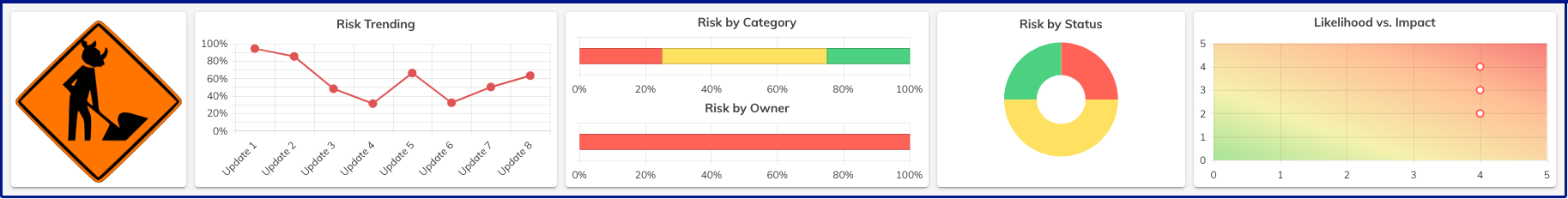
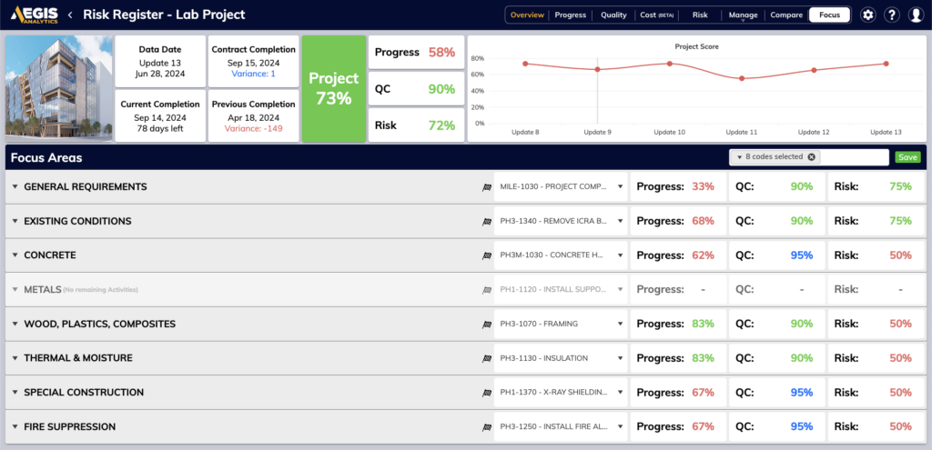
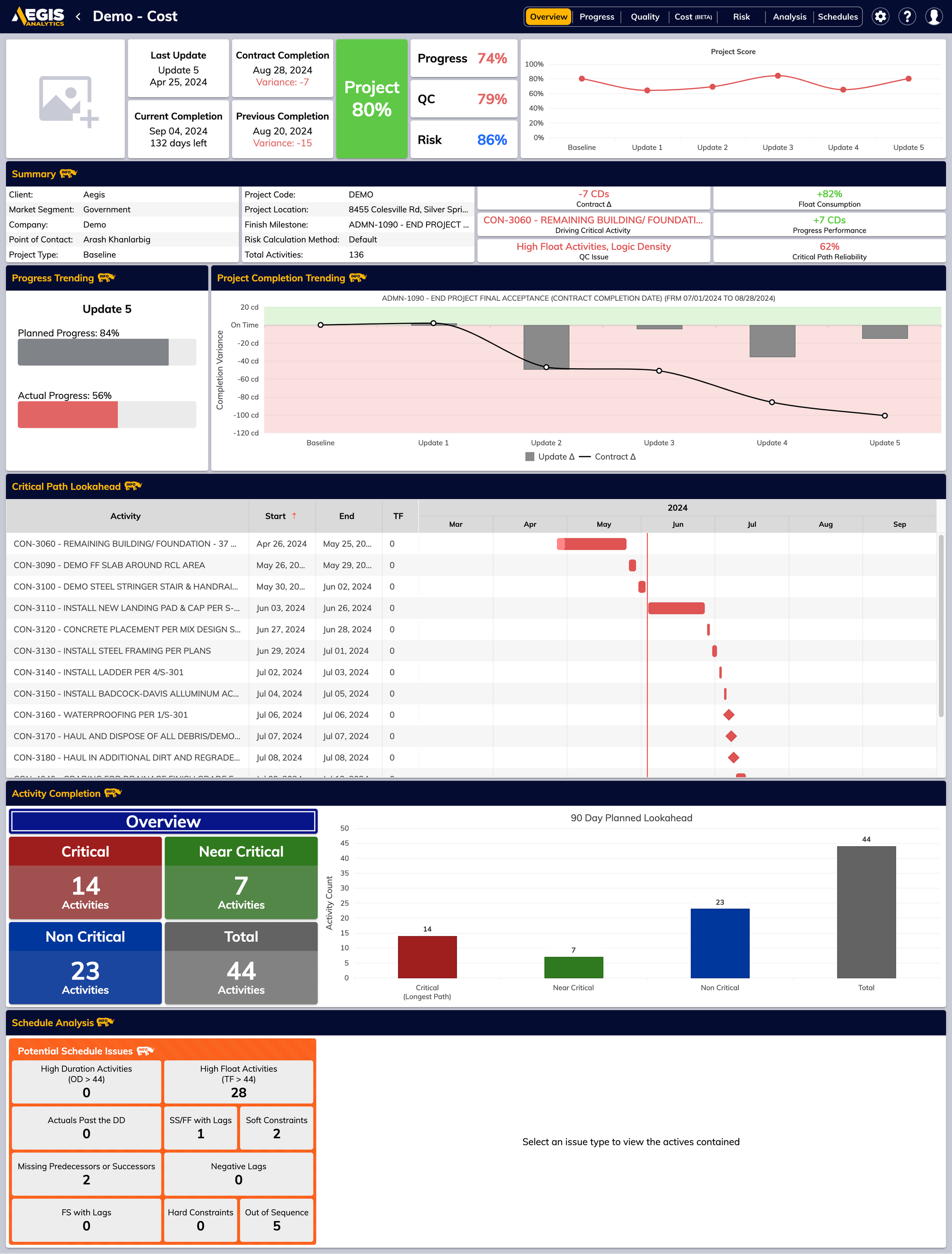
    • Risk Analysis is now even easier with a full suite of overhauled portfolio-level and project-level metrics to gauge your project’s risk.
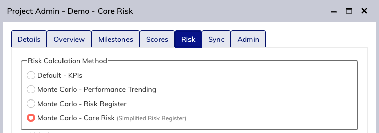
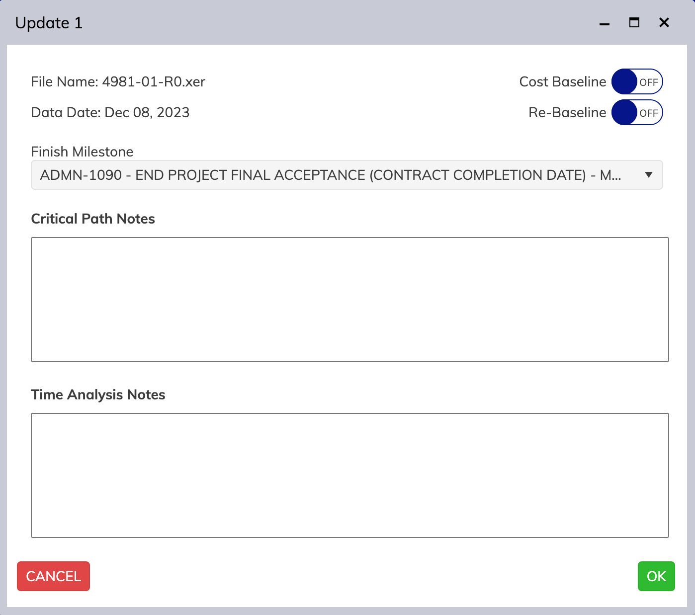
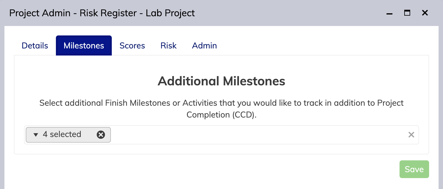
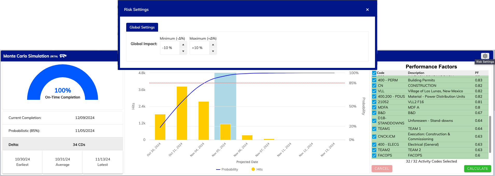
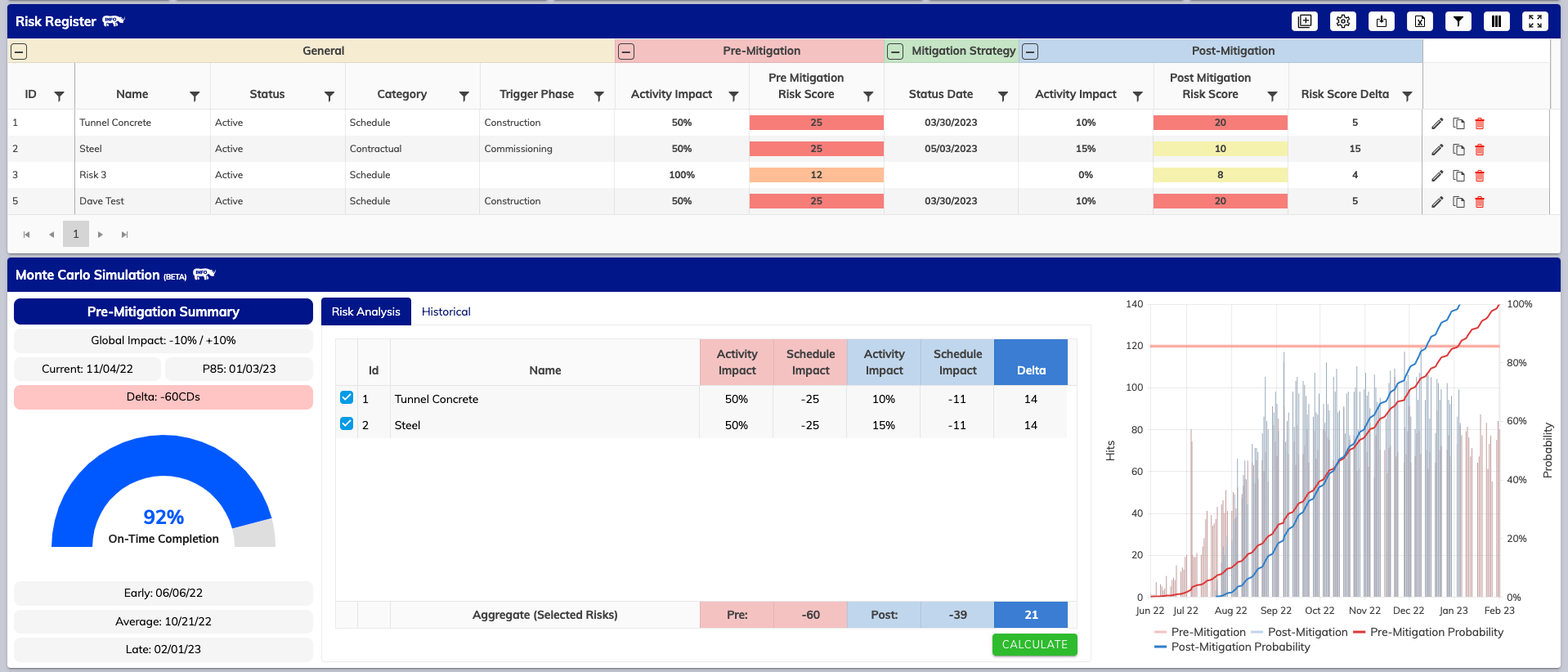
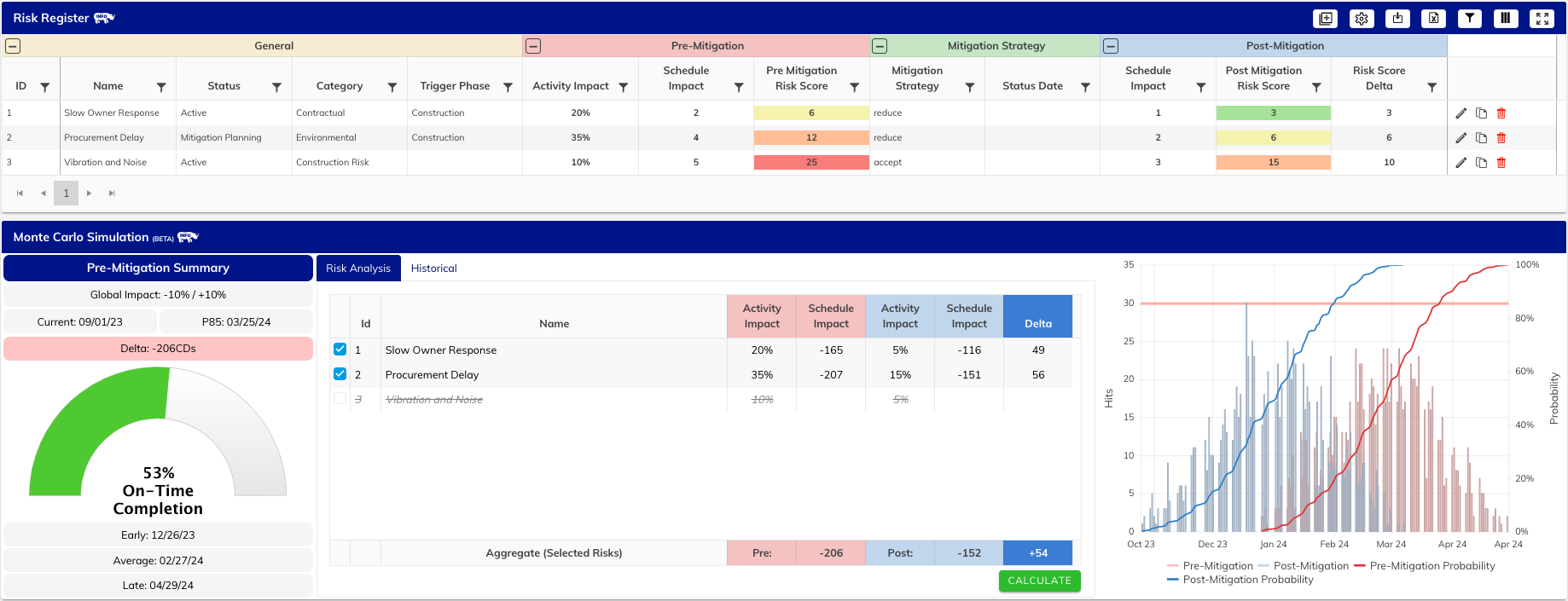
    • Our Cloud Monte Carlo Analysis has been upgraded to now allow for either Performance-based Analysis or Risk-based Analysis through the introduction of a new, fully cloud-based and integrated Risk Register.
    • Archival of past and completed projects right from the context menu
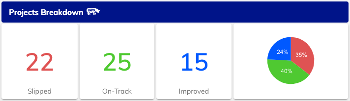
    • Improvements to our portfolio view to give you at-a-glance views of projects that need attention.

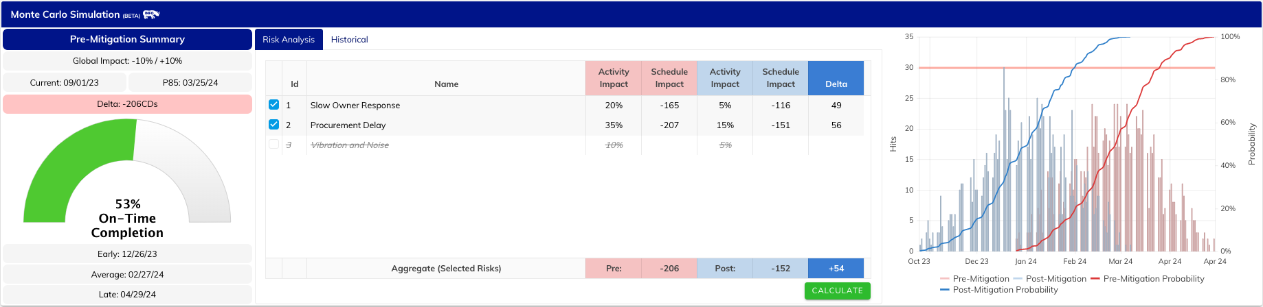
    Keep Control of your Risks, powered by our Cloud Monte Carlo.  ☁️

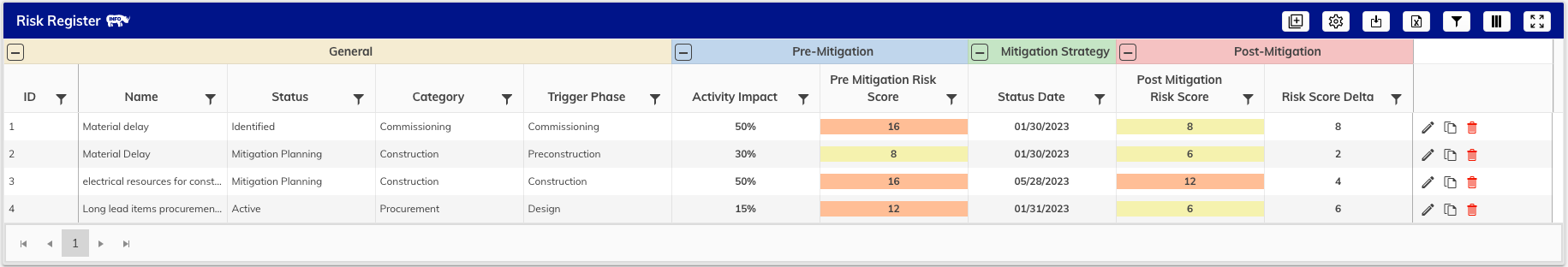
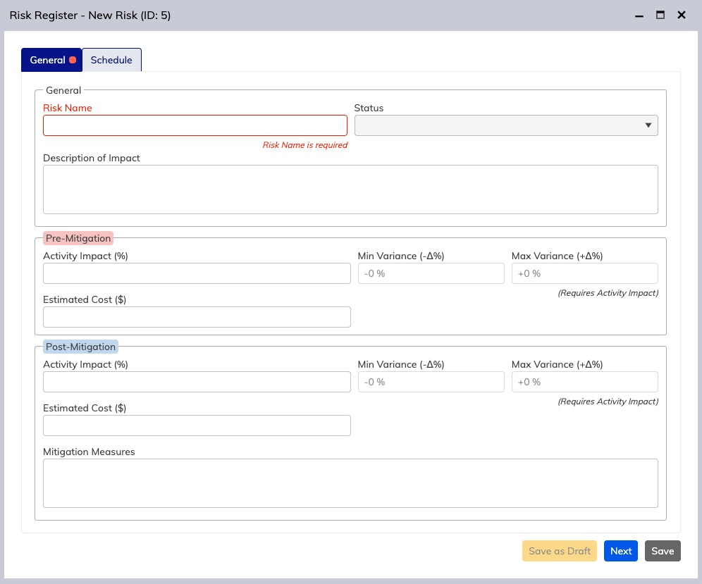
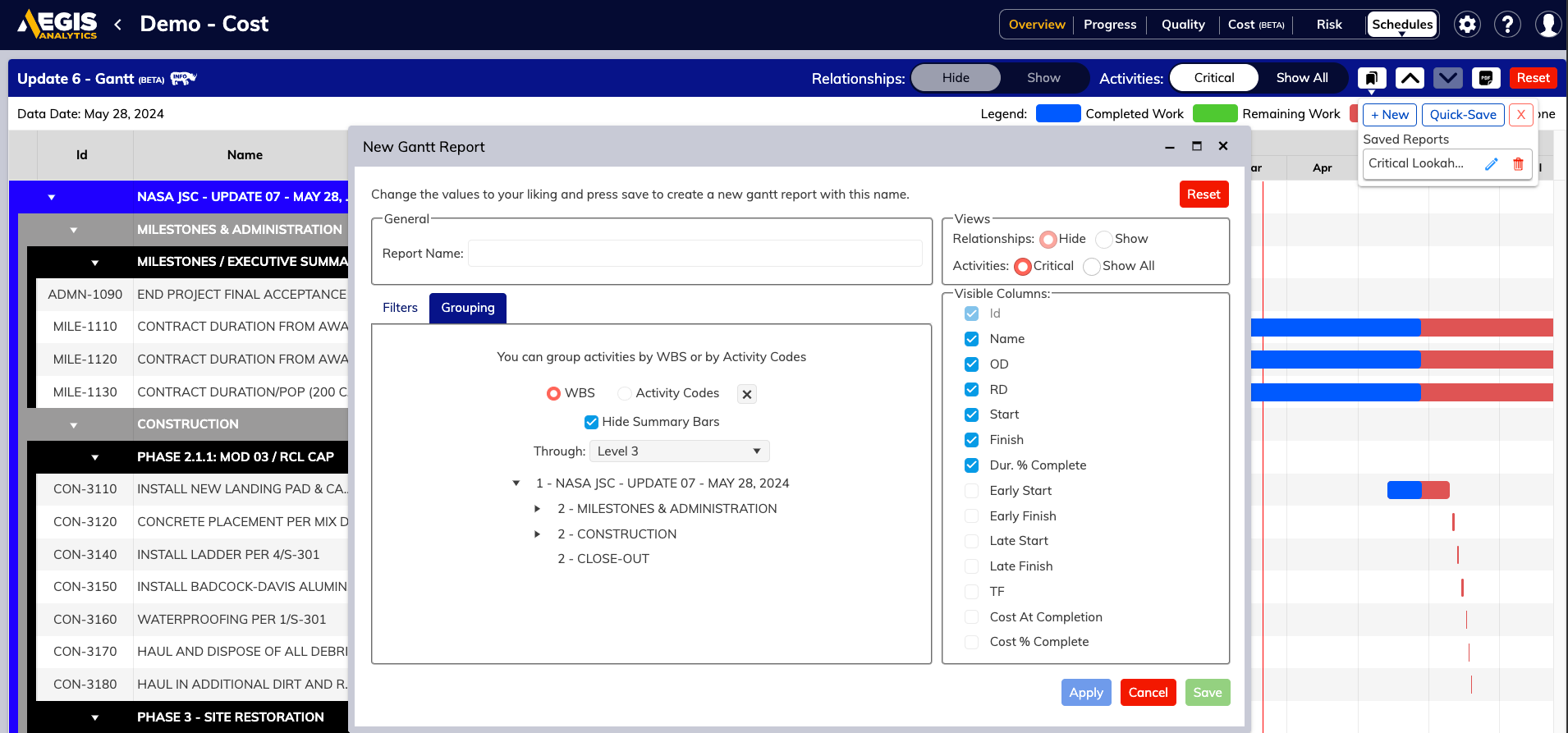
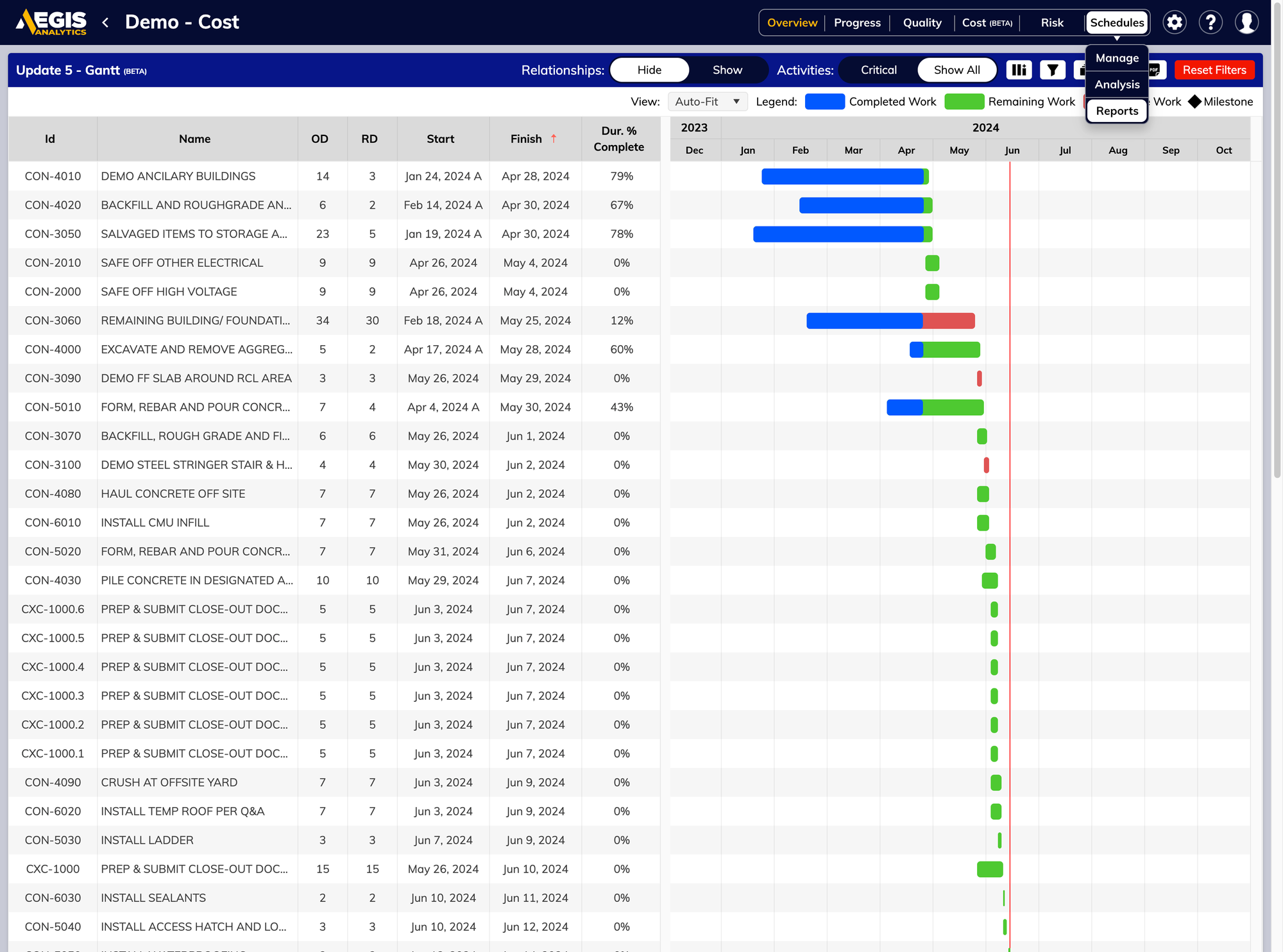
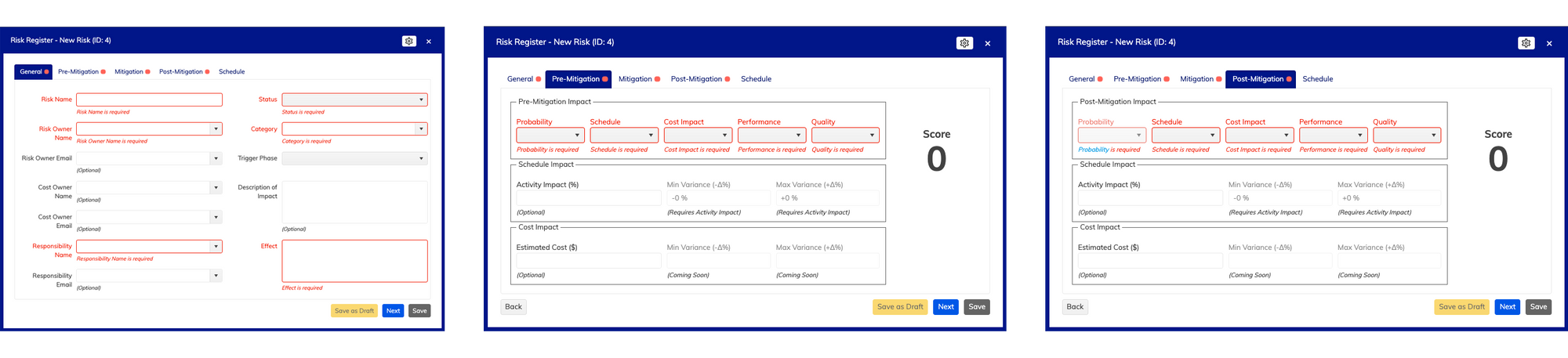
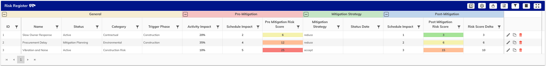
    Welcome to the Risk Register, a brand new way to visualize risk taking cues from our most ardent of excel spreadsheets. With the ability to track Risks by Owner, set mitigation stages and impact scores, and visualize impact and cost right from your Analytics project screen. On any device. Anywhere. And we haven’t even begun to talk about its party tricks.

    A Risk Register so Seamless it’s Magic. 🪄

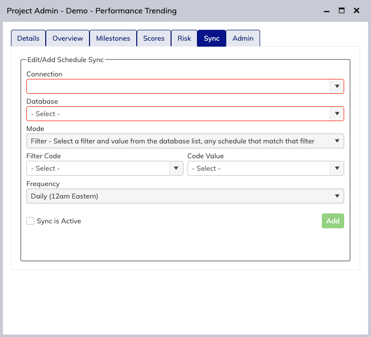
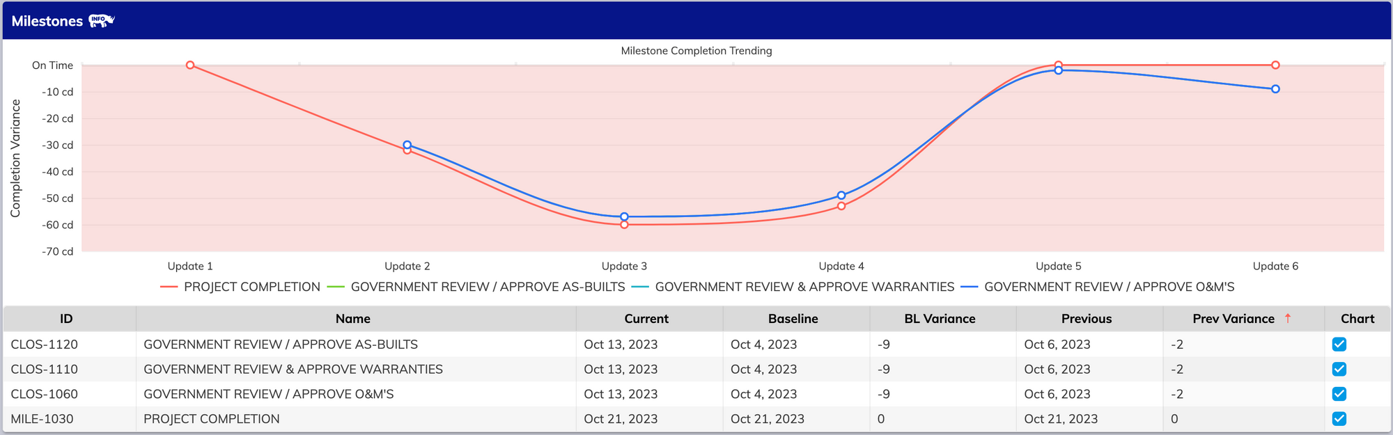
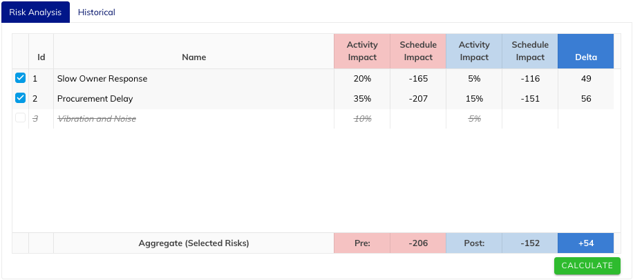
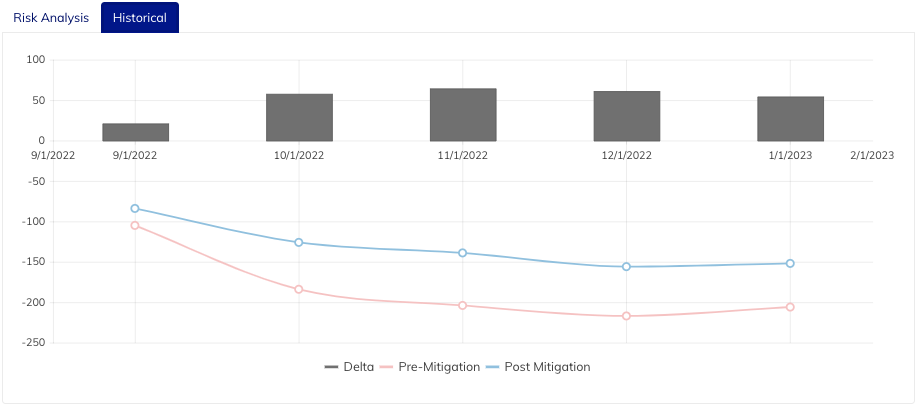
    We’ve integrated our Reactive Risk Register into our revolutionary Cloud Monte Carlo Simulator to give you a peek ahead of how your risk will impact you not just now, but into the future without the need to constantly change your project file to simulate those changes. Impact can also be toggled on and off from the simulation results screen so you can run different simulations with different risks affecting your scenario, and compare outputs from Pre and Post-Mitigation impacts, all in one view. It just works.

    Tag, you’re it. 🏷️

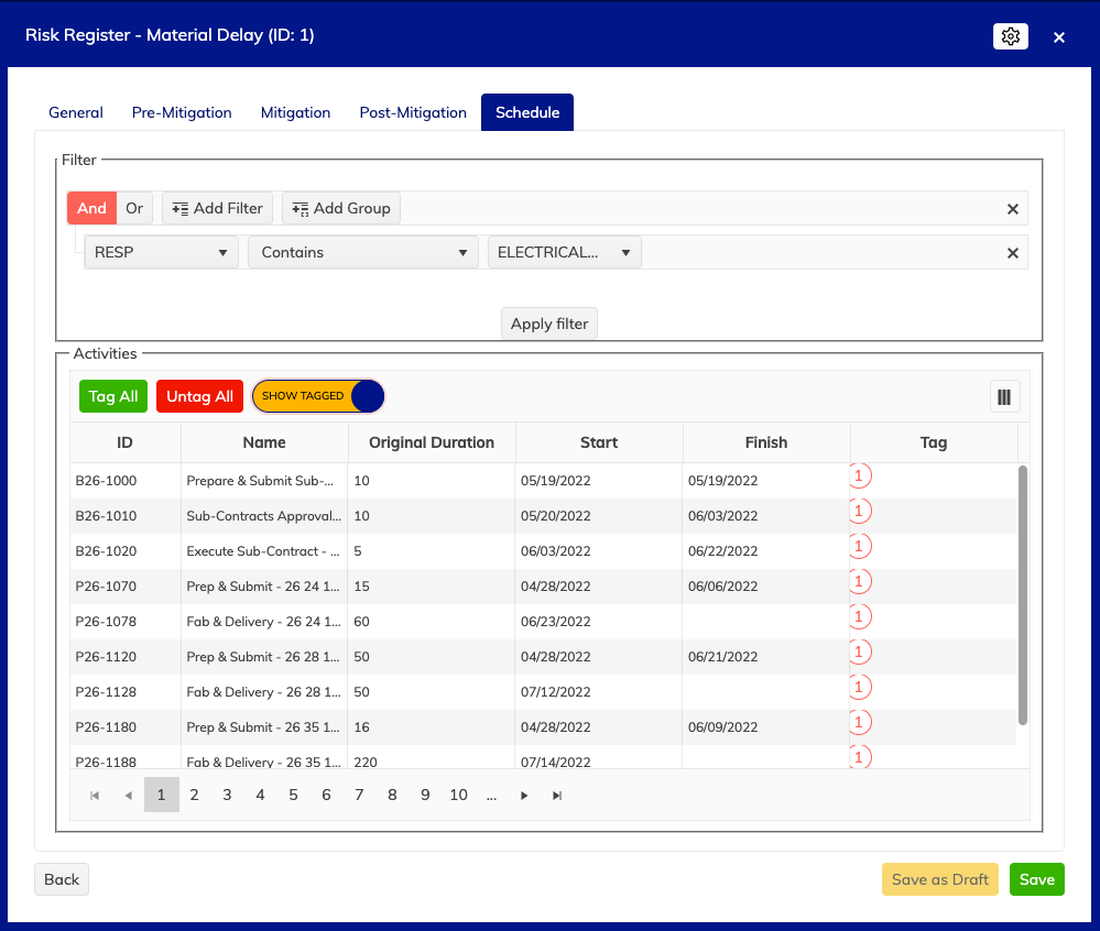
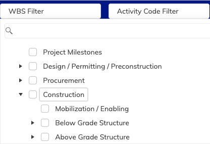
    Tag multiple Risks to multiple Tasks from the schedule tab to impact one, a few, or all tasks with your risk. Pick and choose using our advanced filtering system, and manage it all from a beautiful interface. Oh, and did we mention it tracks from update to update? Tag has never been better.

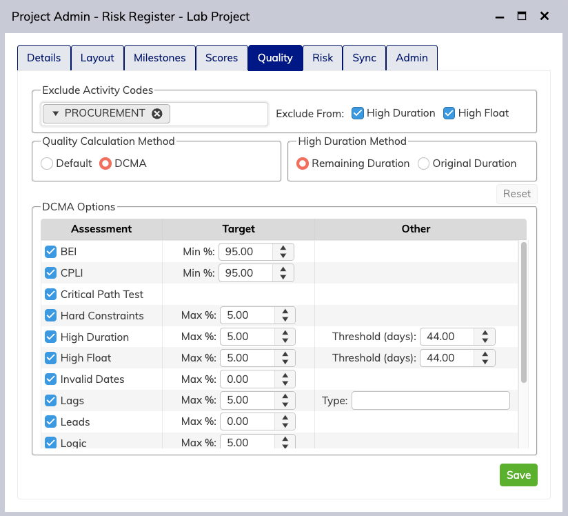
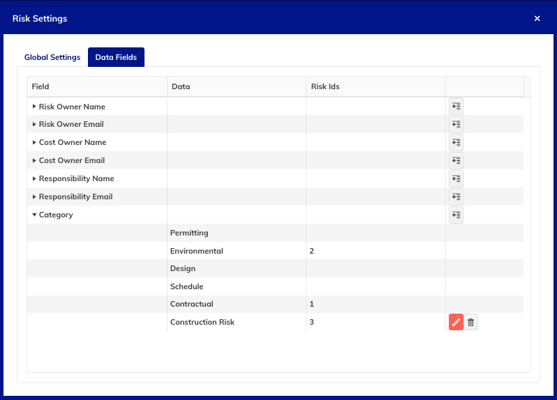
    Customize the Register to make it yours. 🎛️

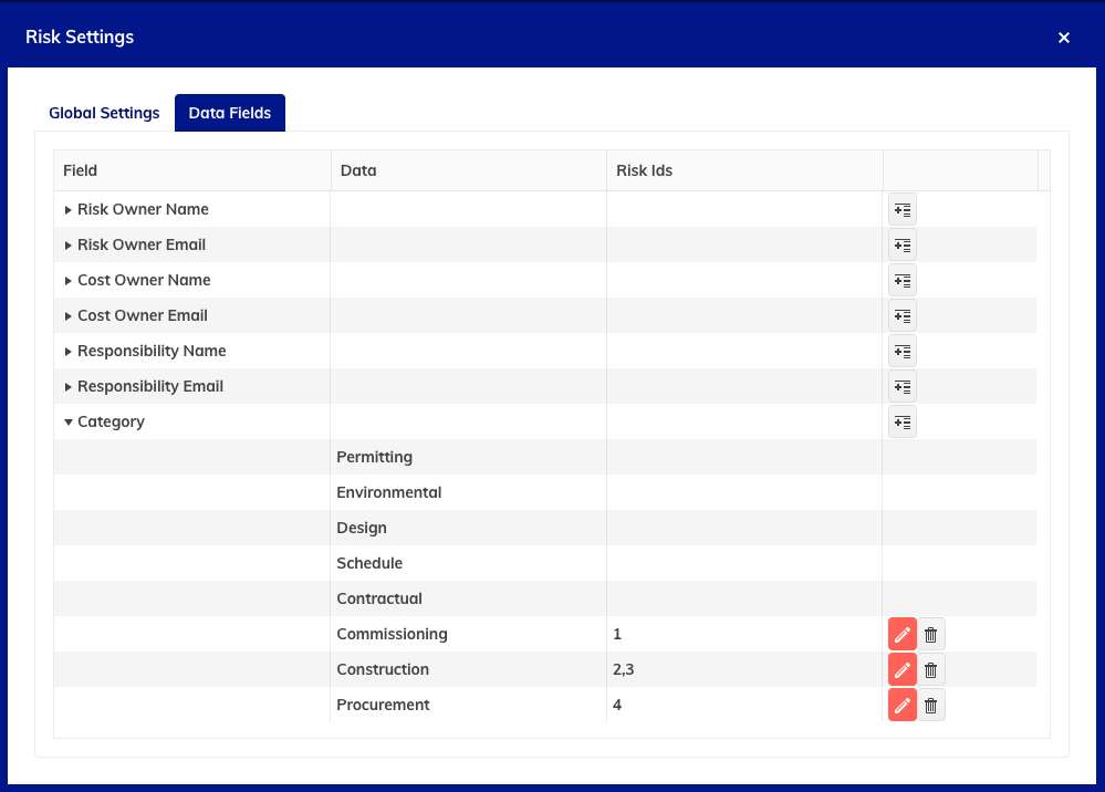
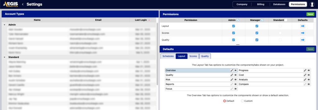
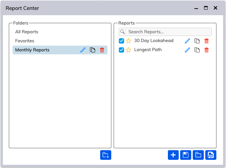
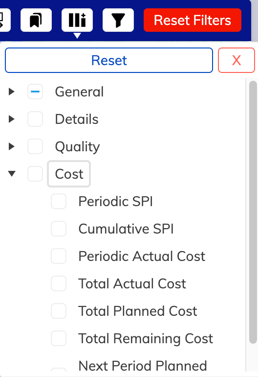
    Modify global impact and associated custom data fields per-project with our Risk Settings pane. Customize and resize your columns to get just the right metrics important to your project. Export the data to Excel and take it with you for that upcoming client meeting. We provide the tools to keep you successful, and keep our competition jealous.

    Import, export, and every port in between. ️🚢

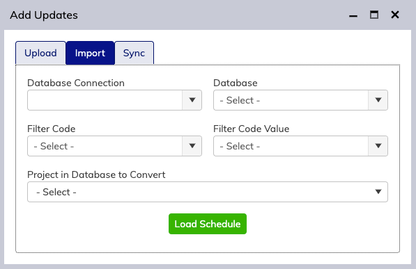
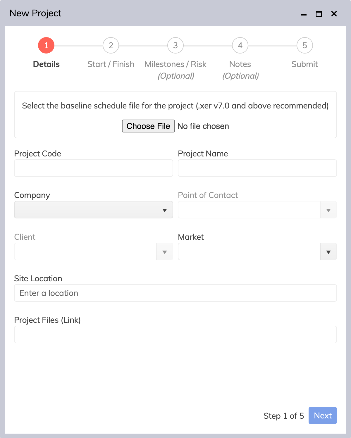
    Bring your existing Risk Register to Analytics using our Excel import tool to cut down on manual entry. Got a client that likes good ol’ paper? No problem. Exporting to a printable sheet has never been simpler. It’s your data, and we’re your safe harbor.

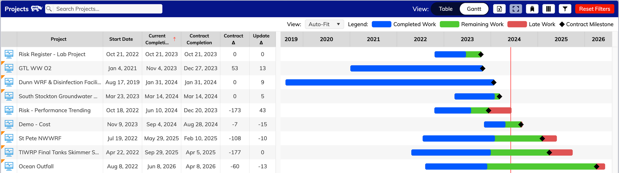
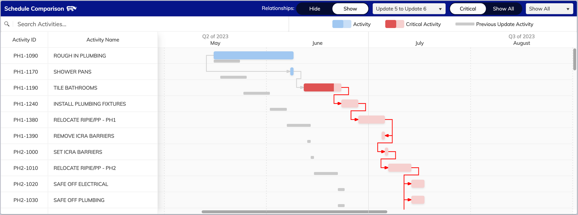
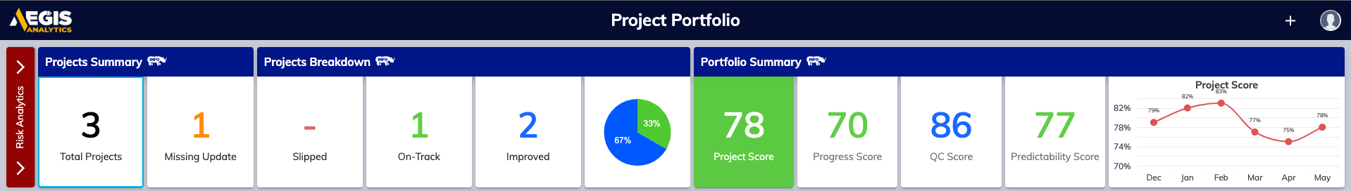
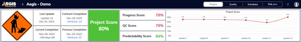
    Beautiful Project Tracking. From Every Angle. 📸

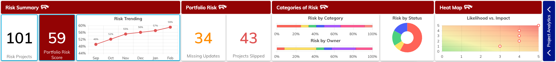
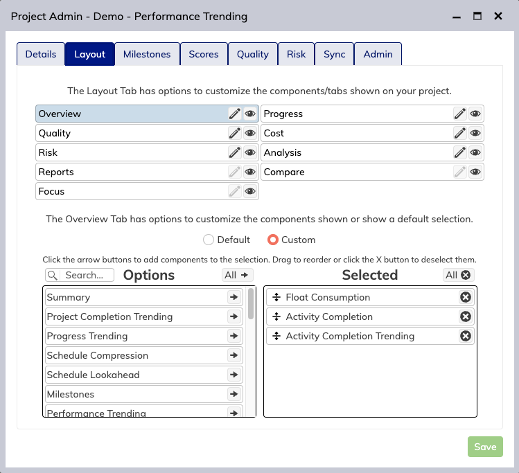
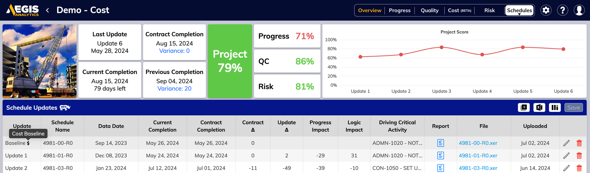
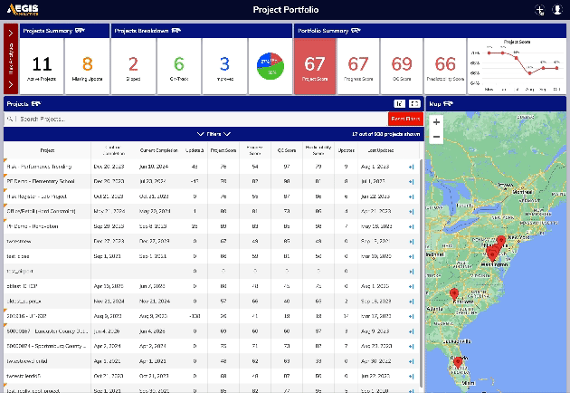
    Our Project Portfolio got some love this update with a dedicated Risk Analytics mode which can be toggled from the main screen, so you can keep your risks front and center with minimal distractions. We’ve also updated our standard banner with helpful charts and graphs, and updated our filter menu to include some of the most requested filters. It’s just all around a great view from any angle.

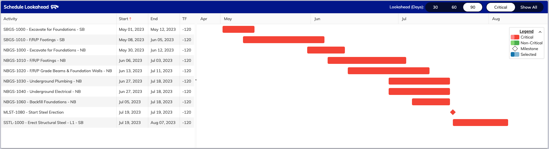
    Keeping schedules up to date just got easier. ✅

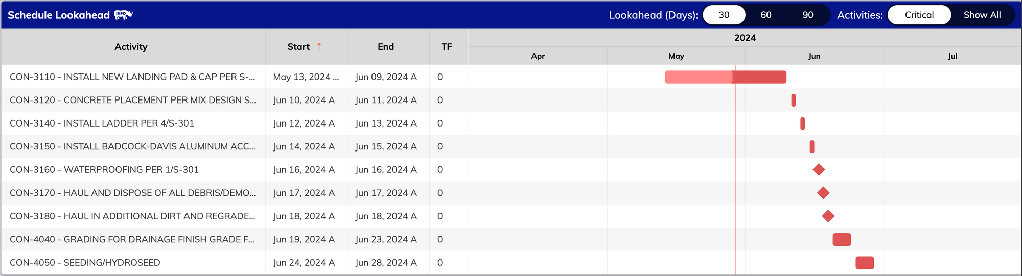
    “At-a-glance” visibility is one of our guiding mantras with Analytics, and to that end we’ve added small pointers to our portfolio page to determine what projects are due for their next update and additional metrics and filtering to get right to the heart of what matters, quickly. A small add for sure, but one we think will have a huge impact on day-to-day use of Analytics.

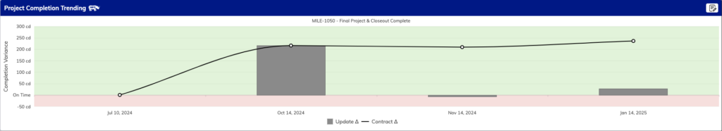
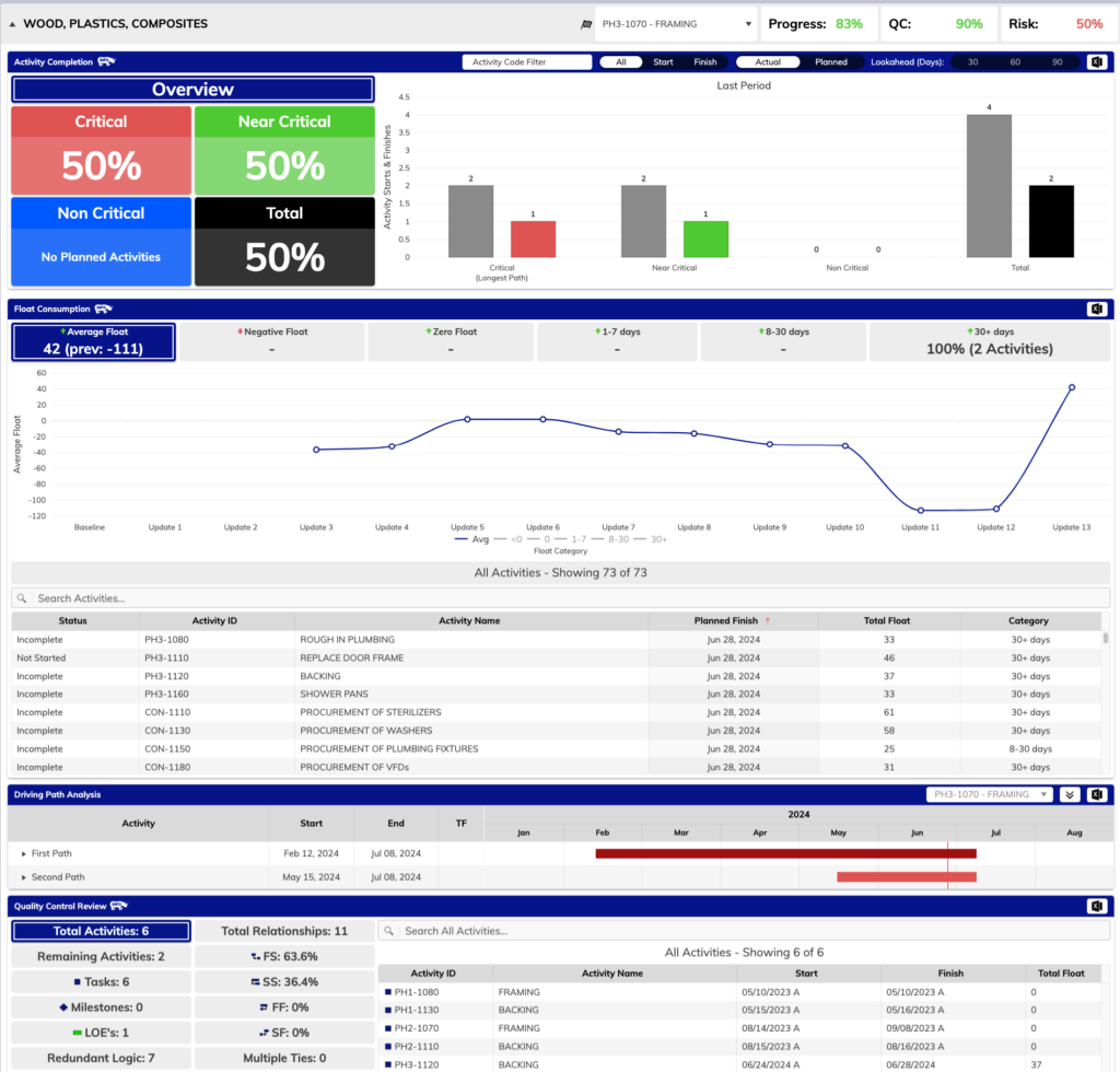
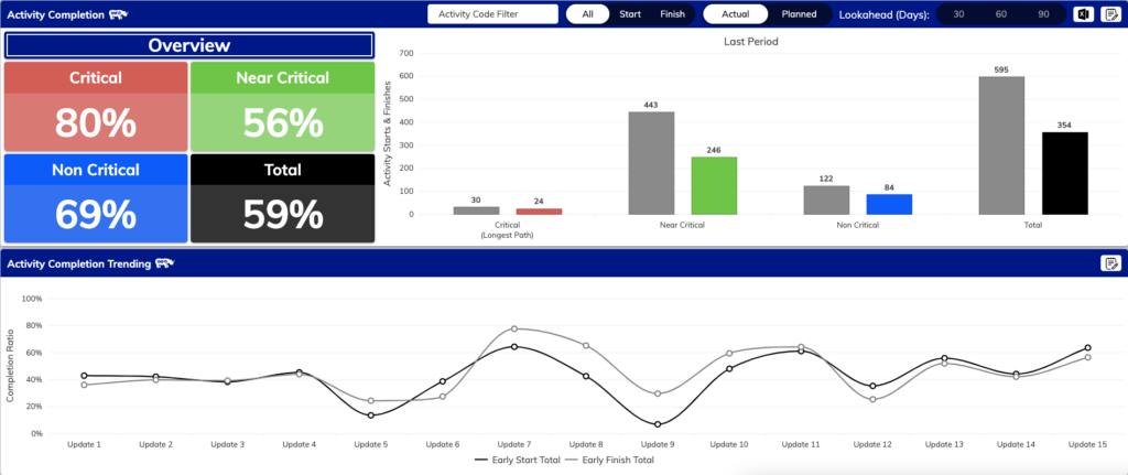
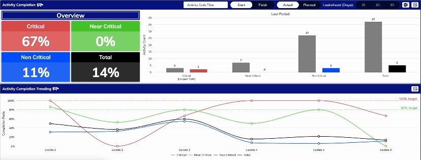
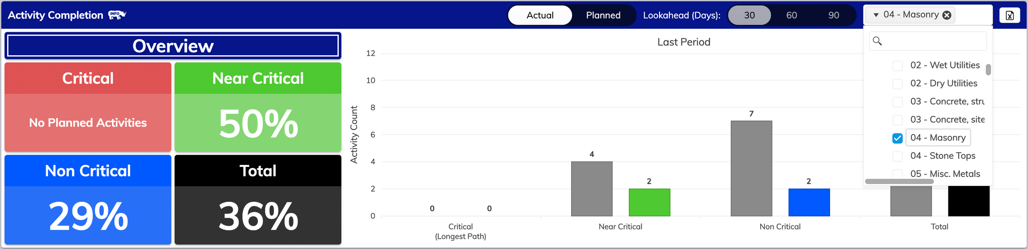
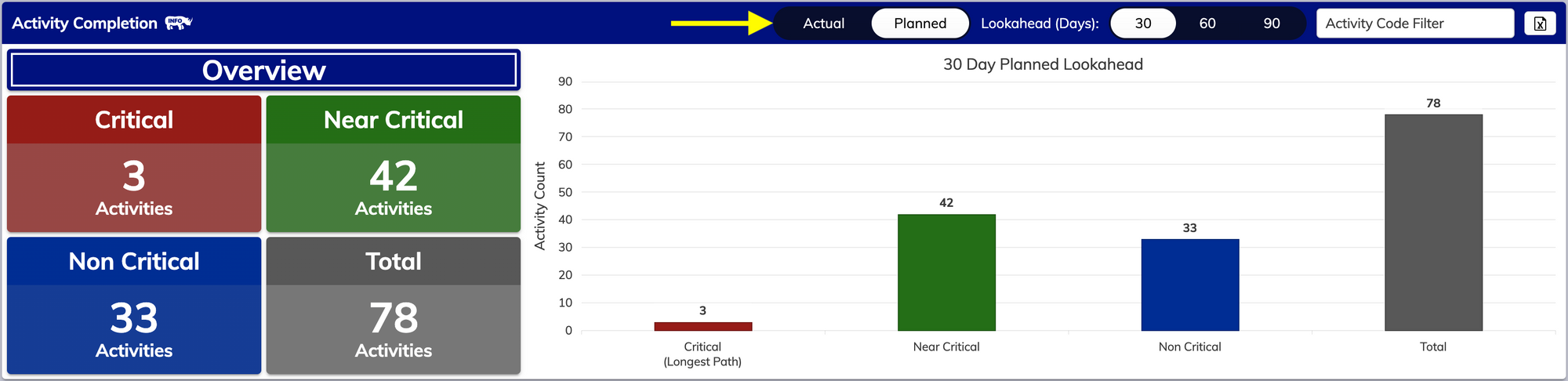
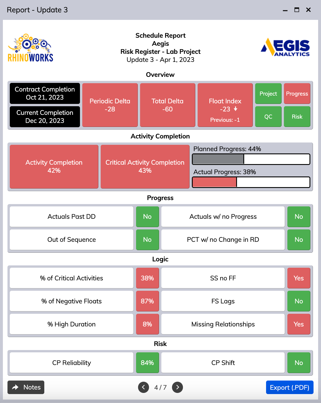
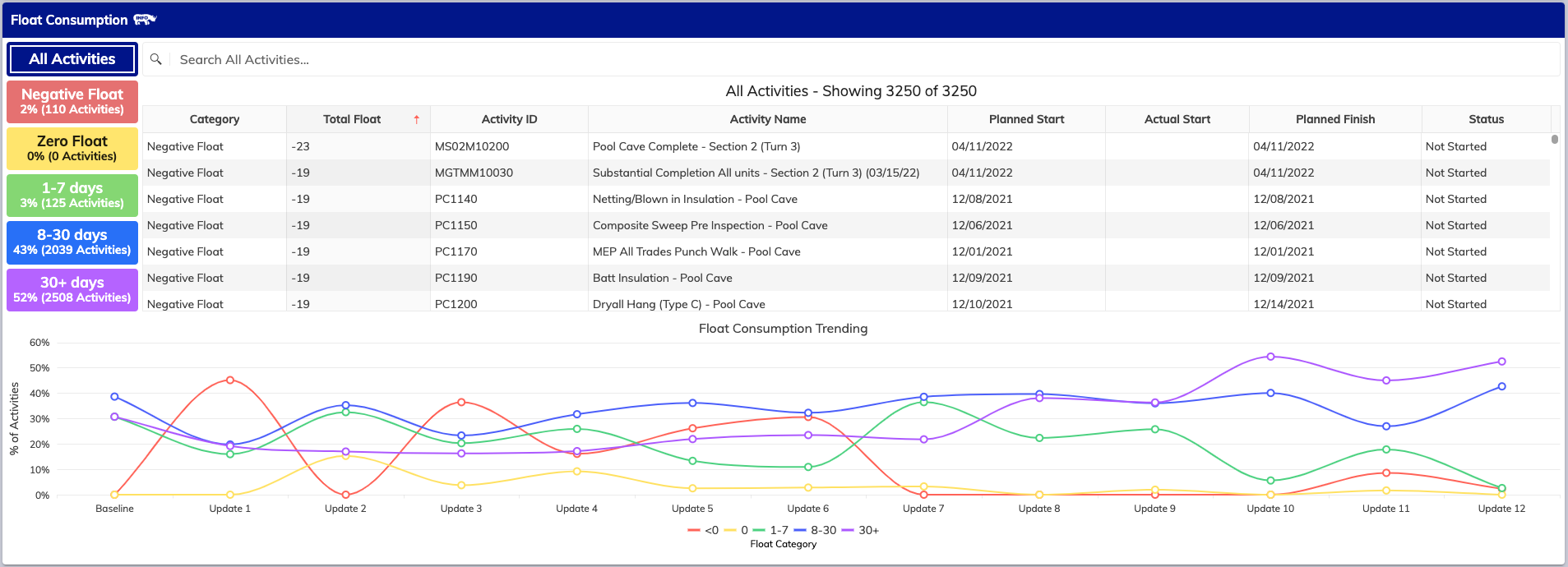
    Diving deeper into completion details. 🏊

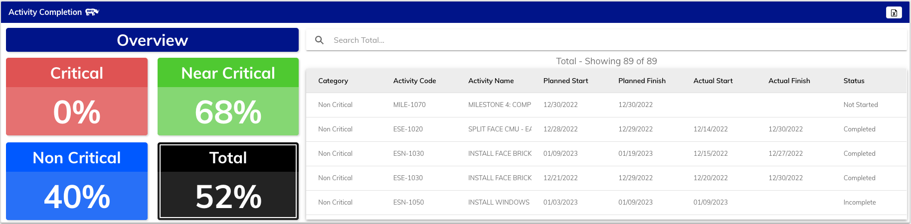
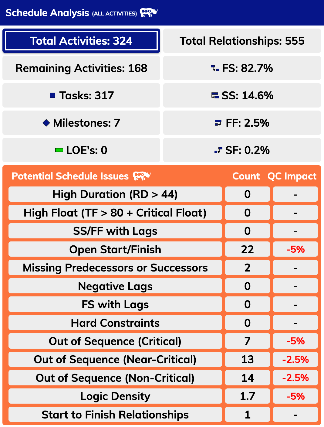
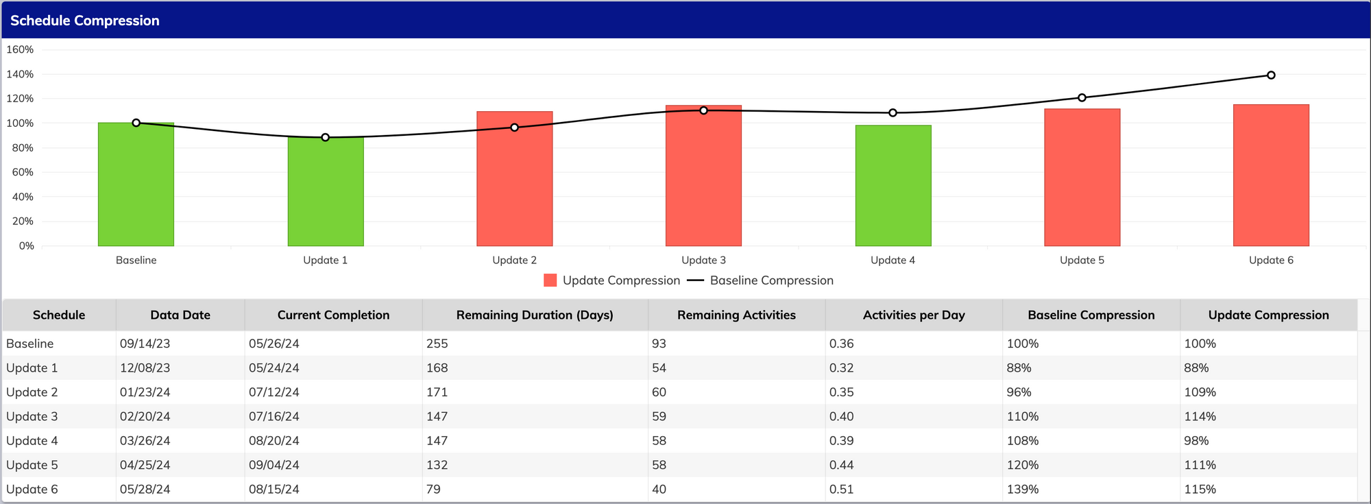
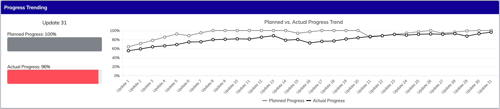
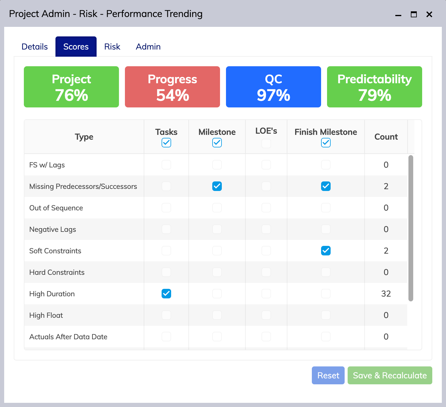
    We’ve updated our Activity Completion pane to give you an overview of what activities are Critical, Near Critical, and Non Critical in our previous update; however, we challenged ourselves to dive even deeper into these important metrics. With 3.0, you can now select these boxes as buttons and view what activities are inside each path, their current status, and their start/finish dates both actual and planned.

    Push the envelope. Charge forward. 🦏

    We always strive to make the best for our customers at Aegis, and Analytics is no exception. While there are countless other updates and easter eggs that deserve their time in the spotlight, we’ll highlight a few here we think deserve special mention in their class.

    • We’ve cleaned up the UI to make better use of screen real estate on smaller devices. Button text has been moved to a popover window.
    • We’ve improved the loading times and speed of the User Interface to make portolios with large amounts of projects load a bit faster and pages more responsive
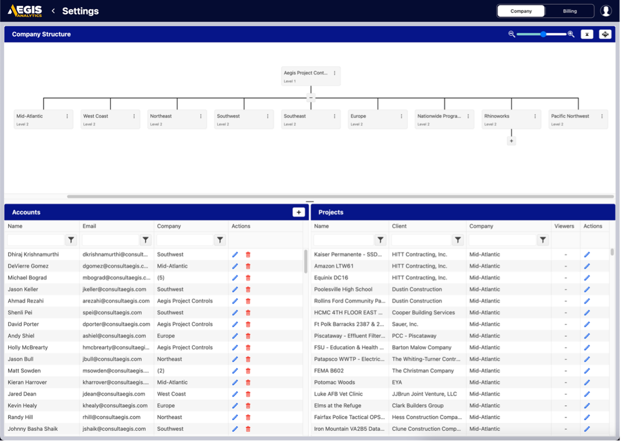
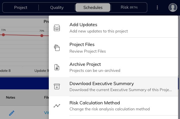
    • You can now archive your project from the context menu on the project page, quickly hiding completed or past projects while keeping the ability to unarchive at any time.
    • Projects already utilizing our Performance Factor-based risk analysis can easily move to Risk Register-based analysis from the context menu on the project page; and back again without losing any data or functionality.
    • We’ve improved the stability and reliability of cloud processing and result delivery to the user interface. We’ve also added progress bars and indicators to help you better visualize progress through the calculation process.

    A Little Rhino with a Big Impact.

    The Sumatran Rhino is the smallest of the living rhinoceroses and the only Asian rhino with two horns. We think this feisty mascot encapsulates the improvements introduced in Analytics 3.0 because while the addition may seem small, this update provides two fantastic ways to keep your project running smoothly in an impactful way that we think will truly push the envelope on what Project Controls should be.

    We hope you share in our excitement by visiting https://dashboards.consultaegis.com/ beginning February 23rd at 7pm Eastern to get started, and we’re looking forward to showing you what we have in store next.

  • Introducing Aegis Analytics 3.0 – Sumatran

    Introducing Aegis Analytics 3.0 – Sumatran

    The future is now with Aegis Analytics v3.0, Sumatran. Take a deep dive into the biggest parts of our newest release and the industry-first features we’re bringing to the table of Project Controls. We think you’ll be just as excited as us when you see what is possible with v3.0.

    The Reactive Risk Register. First of its kind.

    Headlining our 3.0 release is the introduction of the Reactive Risk Register (R3). Our cloud-based risk register was built by risk professionals for our clients. Our risk register integrates directly with both your portfolio dashboard and your project schedules to provide on the fly monte carlo computations for the projects and risks you’re tracking.

    Risk Assignment and Mitigation Analysis. A well-paired match.

    Set risk ownership and tracking details in our easy-entry form, then determine pre-mitigation and post-mitigation scores to accurately compute the risks on your project.

    Our Reactive Risk Register computes both the pre-mitigation and the post-mitigation scenarios of your project. It provides you with an understanding of the aggregate impacts of all the risks and the detailed impacts of each individual risk.

    Aegis Analytics gives you the information you need to determine the most critical risks on your project to create an impactful mitigation plan. Spend your time, money, and effort on the risks and mitigation plans that make the biggest difference on your project.

    Customization to make our Risk Register, yours.

    Configure global settings and data fields to manage how your risks affect the overall performance of your schedule. Customize column layout and even take your data with you for a clean printout. Our goal is to make your Risk Register yours and cut out the bloat experienced with other products and get you to the part that matters most: visible, easy analysis of risk impact.

    Cloud Monte Carlo Analysis with Superpowers.

    With this release, we’ve supercharged our Monte Carlo simulator with tight integrations into your Risk Register. Attach risks to schedule activities and run your analysis based on tracked risks. We even provide on-the-fly toggles to enable or disable risk impacts to view any combination of simulations that you envision. The data is at your fingertips.

    Mitigations, visualized. Finally.

    Mitigation Plans have often historically been kept as separate documents with no easy way to simulate their impact on schedule performance. No more. Our Reactive Risk Register now provides pre- and post-mitigation analysis of your impacts. Our Reactive Risk Register not only computes the aggregate pre- and post-mitigation impacts to your project, but also the individual contributions of each risk.

    Historical Analysis so History never Repeats.

    They say the best way to succeed is to learn from the mistakes of the past, and we’re enabling you to do that with our Historical Analysis feature. Review your project’s historical performance based on your risk metrics to ensure that your mitigation plan is on track.

    We track with our competition. And Speed Past.

    Compared with our contemporaries, we think you’ll find that our simulation is not only tailored for the professional project controls engineer, it’s the preferred method of simulating risk.

    Free for our clients!

    As always, Aegis Analytics and all of its features, including the Reactive Risk Register, is free to all Aegis clients. Reach out to your client representative to get more information. If you’re not a client but interested in demoing our product, please contact sales@consultaegis.com

    Want to learn more?

    You can review our full release notes here: https://news.rhino.works/aegis-analytics-v3-0/

  • Aegis Analytics v2.1

    Based on the tremendous success and engagement from our customers, we’ve released Aegis Analytics v2.1 which improves our Analytics dashboard in several key ways we think you’ll love.

    What’s New?

    • We’ve added Logic Density, Hard Constraints, and Out of Sequence metrics to our Schedule Analysis breakouts on the Quality Control page. These breakouts are also available in the Excel Export.
    • We’ve added the DCMA 14-Point Assessment to the Quality Control page for each project to measure schedule health and quality more effectively against known industry standards.
    • Implemented vastly improved schedule processing to take the rendering time of an uploaded schedule down from minutes to seconds for most schedules.
    • We’ve added better communication methods in our application to inform users of upcoming maintenance or potential downtime. You can still visit our status page any time at https://status.rhino.works/
    • Improved the login process for all users to cut down on load times after login.

    Better metrics. Happier customers.

    We’ve added more metrics in our Schedule Analysis to make it easier for you and your customers to identify schedule health issues and fix problems faster. Logic Density allows you to see the ratio of activities to relationships at a glance and determine schedule complexity on the fly. Hard Constraints and Out of Sequence metrics are now divable and can give you a glimpse into where your schedule may need additional tweaking.

    Industry standards that come standard.

    The Defense Contract Management Agency 14-Point Schedule Assessment is now available on the Quality Page of every project. The DCMA 14-point Schedule Assessment set of criteria was formed in 2005 and firstly it was used by the US Department of Defense. Since then it had become a guideline for schedule review which has been implemented in many project management software widely used in the aerospace and defense industry.

    Ready. Set. Analyze.

    We’ve made major improvements to our schedule analysis processors that improve processing times on 95% of schedules uploaded to our platform. Spend less time waiting and more time analyzing.

    So much more to come.

    From login improvements to under the hood tune ups, v2.1 prepares us for the next round of upgrades and even more beyond that. We can’t wait to share the next release with you.

    How to upgrade to v2.1

    Visit dashboards.consultaegis.com today. The new update will be applied once you refresh.